Charts are an important analytical tool that provide ways to characterize tabular and raster data from multiple variables in graphical form. The charting capability in ArcGIS Pro allows you to select the data for those variables geographically. This provides insight into both the variables and the geographic relationships. For example, for raster data, you can explore variables by a selected area of interest, such as an agricultural field, and explore imagery spectral signatures for different crop types over the growing season.
When exploring vector, raster, and imagery data, the charting tools have many similarities. You can visualize scatter plots of attributes from vector data and examine the correlation between variables in scatter plots just as you can analyze the correlation between spectral bands in imagery.
The manner in which charts are used for vector and imagery data analysis is often different, based on the type of data. For example, with vector data, you may be interested in examining the correlation between variables to establish and quantify relationships; while in imagery, you are interested in reducing the correlation between the bands that are used for feature extraction operations. Additionally, tabular data and categorical raster data are discrete, while imagery data is continuous. This difference in type of data is fundamental to the way each type is handled and analyzed in a chart.
About imagery and raster charts
Remotely sensed imagery and analytical raster data contain robust information about the geographies they represent. Every pixel in an image is a spectral and spatial measurement representing a location in the geography. There are often more than three bands of information that represent a sample of the spectral signature of features being displayed. For scientific data, it may be multitemporal data allowing you to investigate multiple variables over multiple time ranges at specific locations. Viewing the imagery or the scientific data as a raster is the most common way to visualize and understand the data; however, presentations that differ from the visual map view can help make things even clearer, especially when comparing the fine details related to two or more features of interest, or examining patterns throughout time.
Charts designed to explore spectral signatures of features in multispectral imagery are unique to imagery. Raster charts use imagery metadata to properly portray the spectral wavelengths of the bands, and use this information to specify groups of pixels for comparison and analysis. This allows for the design of feature extraction based on remote sensing and image-processing methodologies to derive raster products such as vegetation health and water quality maps. Once continuous imagery data is processed to produce derived categorical data products, they can be further analyzed using vector-based charts.
There are five types of imagery and raster charts: image bar charts, image histogram charts, image scatter plots, spectral profile charts, and temporal profile charts.
Image bar charts
The distribution of categorical raster data can be visualized using bar charts. For example, bar charts can be used to understand the number of pixels in each land cover category, or the total area that falls into a specific risk class. The image bar chart allows you to visualize the distribution of thematic raster data in each category. The raster must have an attribute table to use bar charts.
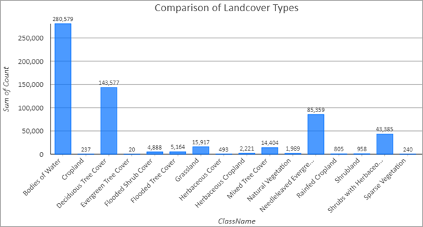
Image histogram charts
When using imagery, you often need to understand the type of information contained in the image. The statistical distribution of the values in a band offers insight into how well the sensor is working and the conditions present when the image was collected. It also provides a metric for characterizing important aspects of image quality. The image histogram chart allows you to visualize and analyze the distribution of pixels for that band. Analysis of image histograms includes statistical measurements, such as skewness of the distribution, plots of mean and median values, and bars to show the standard deviation.
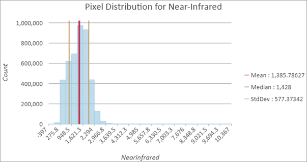
Image scatter plots
Scatter plots portray the spectral information of feature data, allowing you to visualize two bands of information in each plot. This is helpful to understand how correlated or uncorrelated the band information is, and it informs the selection of different band combinations that highlight features of interest in the imagery. If pixels in different bands are highly correlated, only a few bands may be needed for image classification. When the band scatter plot shows that the pixels comprising multiple features are separable, it indicates that both bands are strong candidates for image classification.
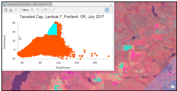
Scatter plots are also useful for analyzing characteristics in transformed image data, such as tasseled cap, principle components analysis, and various indices. The location of features within the scatter plot distribution provides insight into phenomenology, including vegetation health and growth stage of a crop or burn severity after a wildfire.
Spectral profile charts
Spectral profile charts allow you to select regions or ground features on the image and review the spectral information for all of the bands in the image. This provides the spectral fingerprint for features of interest in that region. For instance, if you're comparing two agricultural fields to determine if they contain the same crop, you can select an area from each field and display the summary of pixel values from each band for each field in the spectral profile chart. Differences in spectral signatures are apparent by reviewing the means, standard deviation whiskers, and their place in the spectrum in each chart. Nonspectral bands can also be plotted, which is important for visualizing indices or data from analytical raster datasets. This allows you to determine if a spectral signature is similar or separable, based on the band information from each of the features.
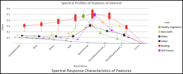
Spectral profile charts are useful for understanding the spectral signatures of features, distinguishing characteristics, and for verifying that the image has been processed correctly. They can be used to assist in the design of raster functions that perform atmospheric correction, or preprocess imagery for image classification.
Temporal profile charts
A temporal profile chart serves as an analysis tool for imagery data in a time series. Visualizing change over time with the temporal profile allows trends to be displayed and compared with variables, bands, or values from other dimensions simultaneously. For example, you can visualize how the vegetation vigor of a crop changes over the growing season, or compare it over multiple years.
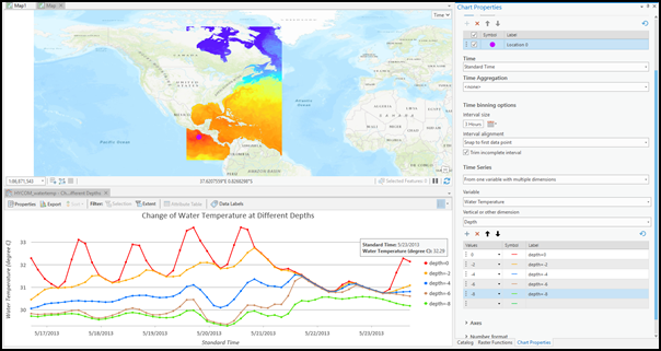
Using the functionality in temporal profile charts, you can perform trend analysis, gain insight into multidimensional raster data at given locations, and plot values that are changing over time in the form of a line graph. A temporal profile chart is interactive—selecting one point on the temporal profile seamlessly switches the map display to the time slice from which the point value was extracted—which provides a convenient way to navigate through the data. Temporal profile charts can be used in various scientific applications involving time series analysis of raster data.