Depending on the type of imagery you're working with, you have a number of options for displaying and symbolizing it. Only symbology types that are valid for the data you've selected are presented. For example, multispectral imagery can be displayed using a three-band color composite—also known as an RGB composite—in which you use the bands available to you to highlight features of interest. You can also display the values along a color scheme to show the areas that are brighter than others. This is referred to as applying a stretch to a dataset. Classify and Discrete can be used to group continuous data into a limited number of groups. Vector Field allows you to display ocean and wind currents as arrows indicating magnitude and direction. This also works with a dataset that has a vector (V) and unit vector (U) component.
Modify the appearance of an image layer
To change the appearance of an image layer, complete the following steps:
- On the Appearance tab, click the top half of the Symbology button.

The Symbology pane appears.
- Set the symbology parameters for your layer.
- Click the bottom half of the Symbology button for access to additional symbology options.
In the Symbology pane, you can fine-tune the parameters specific to the symbology type you selected. You can also select other layers from the Contents pane and, without closing the Symbology pane, apply the same symbology to them.
There are subtle, yet distinct, differences between the options you have when symbolizing imagery. RGB, Unique Values, Stretch, Colormap, Classify, and Discrete all accomplish similar adjustments but in different ways. Stretch is the classic color scheme option; it takes the range of all the values in your data and stretches it to fit within a data type range. For example, 8-bit data is stretched from 0 to 255. Unique Values is similar, except the colors are not continuous. This is appropriate for qualitative data such as land cover. The Discrete color scheme is continuous, as is Stretch, but you decide how many colors it uses to display your data with no legend in the Contents pane. It then groups the values of pixels together accordingly. Classify is similar to Discrete, except it considers the distribution of values and groups the values into the number of breaks or colors you want to display. A color map is useful when you want to select a color for each pixel value. These can be saved, imported, and exported for use on other datasets. Vector Field allows you to display phenomena such as currents as arrows, or vectors, in which the direction of the arrow indicates the direction of the current, and the size of the arrow is related to the force of the current. Vector Field can be applied to a dataset with a magnitude and direction or a U and V component.
Save symbology settings as a template
You can save your symbology settings as a template in the Symbology pane and reuse them as custom functions that can be applied from the Raster Functions pane. This generates a template that contains the appropriate functions to replicate the symbology used to display the layer of a raster dataset, mosaic dataset, or image service. You can do the following with this template:
- Use it as a processing template for a mosaic dataset. Open the Raster Type properties, click the Functions tab, right-click a template in Processing Template, and click Load.
- Edit the function chain in a mosaic dataset or its items using the Edit Function Chain option in the layer context menu.
To save a template of symbology settings as a function that can be accessed from the Raster Functions pane, complete the following steps:
- Add a raster dataset, mosaic dataset, or image service to a map.
- Click the Symbology button on the Appearance tab.
- Modify the symbology, such as applying a stretch or using a different color scheme.
- Click the Options button
 in the Symbology pane and choose Export as raster function template.
 - Provide a name for the template.
- Choose a Custom Category and Sub-Category.
- Provide Description text, choose a Type, and click OK.
RGB
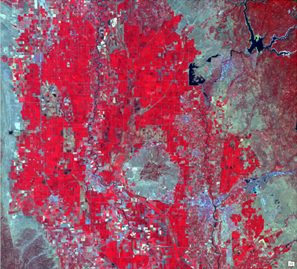
The color model RGB stands for red, green, and blue. RGB symbology allows you to create composite images by loading multispectral bands into each channel (R, G, and B). The various band combination can help highlight specific features on the image.
Primary symbology
Under Band Combinations, select the bands you want to display as red, green, and blue. To obtain a natural-looking image, match the red image band with the red video display channel, green with green, and blue with blue. You can also create other composites that highlight how features respond to various parts of the electromagnetic spectrum. For example, load the near infrared band into the red drop-down list, the red band into the green drop-down list, and the green band into the blue drop-down list. This creates a color infrared composite that uses the strong reflection of vegetation in the near infrared band and displays areas of high vegetation as red. The Invert checkbox can be checked on to invert each band to create a negative image.
Use Stretch Type to define the range of values to display. This is often used to eliminate extreme high and low values that represent noise in imagery. When you choose one of the options from the Stretch Type drop-down list, the parameters that you set here are used. The following are the Stretch Type options:
- None—Does not apply any stretch to the layer, even if statistics exist. To display data other than 8-bit data, image values are linearly mapped between 0 and 255. None is a good choice if you want to examine absolute values in your raster datasets.
- Minimum Maximum—Applies a linear stretch based on the output minimum and output maximum pixel values, which are used as the endpoints for the histogram. For example, in an 8-bit dataset, the minimum and maximum values could be 33 and 206. A linear stretch is used to distribute the values across 256 values, from 0 to 255. In this example, 33 is mapped to 0, 206 is mapped to 255, and the values between these endpoints are linearly distributed. This increases the ability to see differences in values throughout the dataset.
- Percent Clip—Cuts off a percentage of the highest and lowest values and applies a linear stretch to the remaining values across the available dynamic range of the data type. This reduces the effects of outliers in the datasets and enhances the remaining data.
- Standard Deviation—Applies a linear stretch between the values defined by the standard deviation (n) value. For example, if you define a standard deviation of 2, the values beyond the second standard deviation become 0 or 255, and the remaining values are linearly stretched between 0 and 255.
- Histogram Equalization—Applies a nonlinear contrast stretch in which the values are spread out throughout the bit depth range. This method is appropriate when there are a lot of pixel values that are closely grouped together.
- Histogram Specification—Allows you to load the histogram from an XML file. This also allows you to edit the histogram in a piecewise fashion in which you can assign a linear stretch to multiple ranges of values within your data.
- Custom—Allows you to edit the histogram in a piecewise fashion in which you can assign a linear stretch to multiple ranges of values within your data. This is the set stretch type when you create a custom stretch of any kind.
- Esri—Based on a sigmoidal stretch, which makes it ideal for maintaining contrast in bright areas, such as an urban area surrounded by a desert.
The Histogram button  allows you to view the histogram distribution of the pixels, and the Minimum Maximum, Percent Clip, and Standard Deviation stretch types allow you to view the pixel distribution and interactively set the minimum and maximum input values. See Raster histogram stretching for more information about the Histogram page.
Adjust the Gamma setting of your imagery to highlight the contrast of moderate pixel values.
There are two subtabs on the Primary symbology tab  :
:
- Statistics
- Mask
The Statistics tab is used to determine how to display the data. The Statistics drop-down menu contains DRA (dynamic range adjustment), Dataset, and Custom options. When DRA is chosen, the statistics based on the current display extent are calculated as you zoom and pan the image. The Dataset option calculates the statistics for the entire dataset and uses those values regardless of the portion of the image that is displayed. You can also input your own statistics in the table using the Custom option. You can do this by importing the statistics from another dataset or importing an .xml file from the Options menu. When you're finished, you can save your custom statistics.
The Mask subtab is used to remove background values and set the NoData values. If you want to set the background value, you need to do so for each band. Although these values are often the same for each band, they may change. Check the Display background value check box, provide the values that represent the background, and choose the color for the background. You can also choose a color for the NoData pixels.
RGB options
You can access the RGB options from the Options button  at the top of the Symbology pane.
You can import a layer or a package to set the parameters.
You can save your symbology as a raster function template.
Unique Values
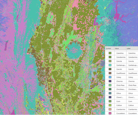
Unique Values symbology randomly assigns a color to each value in your dataset. This is often used with thematic data, such as land cover, for its limited number of categories. It can also be used with continuous data if you choose a gradient color scheme.
Primary symbology
Field 1 specifies the field in your attribute table that is used to symbolize your unique values. Color scheme is used to quickly color each unique value. You can optionally choose a color for each value if a preset color scheme does not fit your data.
To choose a color for NoData pixels, set the NoData value. Transparency is usually used and is the default.
Advanced symbology options
On the Advanced symbol options tab  , you can format the labels of category names. When you make changes here, they are automatically updated in the Contents pane.
Unique Values options
Access the Unique Values options using the Options button  at the top of the Symbology pane.
You can import a layer or a package to set the parameters.
You can also import or export your color map settings.
You can save your symbology as a raster function template.
Stretch
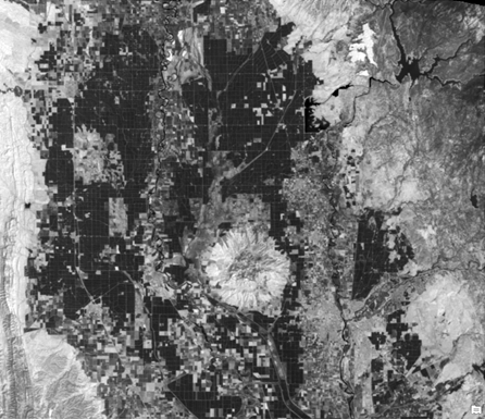
Stretch symbology allows you to define the range of values to be displayed and apply a color ramp to those values.
Primary symbology
The following are the Stretch options:
- Band—Selects the band to stretch in a multiband dataset.
- Invert—Inverts the color scheme, to create a negative image.
- Label—Refers to the labels in the Contents pane.
- Stretch type—Defines the range of values to display.
- Histogram—Allows you to view the histogram distribution of the pixels and edit the histogram stretch for the Minimum Maximum, Percent Clip, and Standard Deviation stretch types. See Raster histogram stretching for more information about the Histogram page.
- Gamma—Controls the amount of contrast in moderate pixel values.
There are three subtabs on the Primary symbology tab  :
:
- Statistics
- Mask
- Advanced Labeling
The Statistics tab is used to determine how to display the data. The Statistics drop-down menu contains DRA (dynamic range adjustment), Dataset, and Custom options. When DRA is chosen, the statistics based on the current display extent are calculated as you zoom and pan the image. The Dataset option calculates the statistics for the entire dataset and uses those values regardless of the portion of the image that is displayed. You can also input your own statistics in the table using the Custom option. You can do this by importing the statistics from another dataset or importing an .xml file from the Options menu. When you're finished, you can save your custom statistics.
The Mask subtab is used to remove background values and set the NoData values. If you want to set the background value, you need to check the Display background value check box, provide the value that represent the background, and choose the color for the background. You can also choose a color for the NoData pixels.
The Advanced Labeling subtab is used to better convey the stretched data that you are displaying. It allows you to set your own labels and create your own color schemes. For more information about advanced labeling, see Advanced labeling for a continuous raster dataset.
Advanced symbology options
On the Advanced symbol options tab  , you can format the labels of category names. When you make changes here, they are automatically updated in the Contents pane.
Stretch options
You can access the Stretch options using the Options button  at the top of the Symbology pane.
You can import a layer or a package to set the parameters.
You can save your symbology as a raster function template.
Colormap
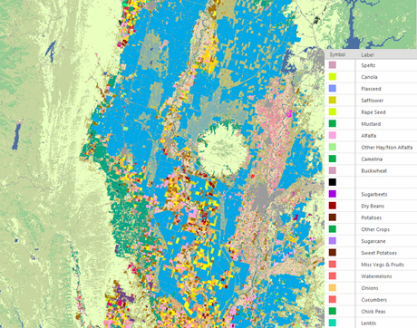
Colormap symbology applies the color map associated with the raster.
Primary symbology
Each label has an associated preset color. If you want to change the color, you can import a color map or layer file.
To choose a color for NoData pixels, set the NoData value. Transparency is usually used and is the default.
Advanced symbology options
On the Advanced symbol options tab  , you can format the labels of category names. When you make changes here, they are automatically updated in the Contents pane.
Colormap options
You can access the Colormap options using the Options button  at the top of the Symbology pane.
You can import a layer or a package to set the parameters.
You can also import or export your color map settings.
You can save your symbology as a raster function template.
Classify
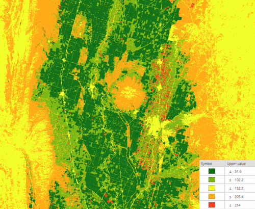
Classify symbology allows you to group pixels in a specified number of classes. You can then edit the break points between each class.
Primary symbology
The Classify options are as follows:
- Field—Represents the values of the data.
- Normalization—Allows you to divide the values from Field by another attribute. There are also options for Percent of total and Log normalization techniques.
- Method—Specifies how the break points are calculated.
- Classes—Sets the number of groups to symbolize.
- Color scheme—Specifies the color ramp for displaying your data.
- Nodata—Specifies the color for displaying NoData values.
Use the table to make changes to individual groups, such as changing the color of a particular group of values or adjusting its range of values.
There are three subtabs on the Primary symbology tab  :
:
- Classes
- Histogram
- Mask
The classes show the color and value ranges for each class. The value ranges can be adjusted with the preset methods. The upper value can be manually edited in the table or by adjusting the class breaks with a histogram.
To choose a color for NoData pixels, set the NoData value. Transparency is usually used and is the default.
Advanced symbology options
On the Advanced symbology options tab  , you can format the labels of category names. You also have the option to exclude values or set the sample size. Any values within the range set by Exclude Values are displayed as NoData. To estimate the statistics and resulting histogram, you can use a skip factor, which systematically samples pixels based on the number of rows and columns you want to skip. You can ignore values to adjust how the image is rendered by excluding those values from the distribution. When you make changes here, they are automatically updated in the Contents pane.
Classify options
You can access the Classify options using the Options button  at the top of the Symbology pane.
You can import a layer or a package to set the parameters.
You can save your symbology as a raster function template.
Discrete
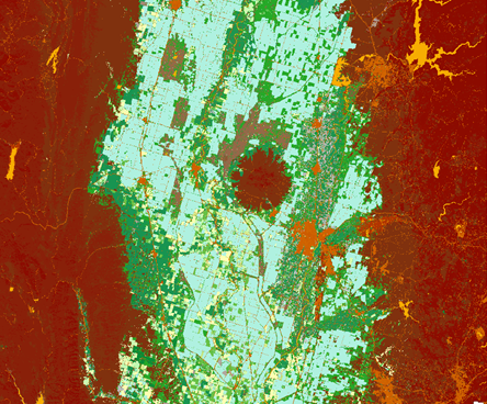
Discrete symbology displays your dataset using a specific number of colors. Each color represents the same value and when the colors have all been used, it reuses the color scheme for the next set of values.
Primary symbology
You can choose the color scheme and the number of values that the color scheme can accommodate for each time it is used. A low number of colors means that only part of the color scheme may be used. A larger number means that there is less differentiation between the adjacent values.
To choose a color for NoData pixels, set the NoData value. Transparency is usually used and is the default.
Discrete options
You can access the Discrete options using the Options button  at the top of the Symbology pane.
You can import a layer or a package to set the parameters.
You can save your symbology as a raster function template.
Vector Field
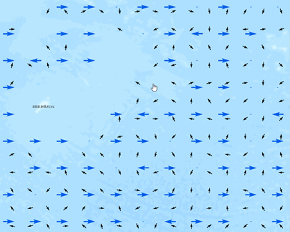
Vector Field symbology uses a magnitude and direction component—or a U and V component, sometimes referred to as the zonal velocity and the meridional velocity—to display your data. A common use is to display ocean or wind currents as arrows in which the direction indicates the flow, and the size of the arrow is related to the power of the current.
Primary symbology
By default, the pane is set up to work with data that shows magnitude and direction. You can also use the Vector Field renderer to visualize a single raster layer with a vector symbol. Select the appropriate bands or variables for these inputs. There are two ways to calculate flow. Meteorological displays the vectors based on the direction from which the current is coming. Oceanographic is the opposite; it shows the direction the current is flowing.
There are several options for Symbol type, including a single arrow, which is a generic option applicable to many scenarios. There are also options for displaying wind as barbs or based on the Beaufort wind scale, and for displaying ocean currents.
Symbol spacing refers to the size of the area that each vector represents on the map.
Symbol size ranges from 0 to 100. Decreasing this range from its full extent allows you to visualize a greater level of detail in the moderate values.
The More properties button adjusts the minimum and maximum values for the magnitudes, changes the units, and adjusts the angle reference system and direction.
Advanced symbology options
The following parameters are available on the More Properties tab:
- Magnitude—Allows you to set the minimum and maximum magnitude range.
- Unit—Allows you to set the measurement units for the magnitude.
- Angle reference system—Allows you to specify how the direction of the component was measured. Arithmetic indicates 0 degrees is due east and 90 degrees is due north. Geographic indicates 0 degrees is due north and 90 degrees is due east.
- Angle direction—Allows you to specify the direction of the mass flow. From (meteorogical) indicates the mass is flowing along the angle and moving toward the origin of the reference system. To (oceanographic) indicates the mass is flowing along the angle and moving away from the origin of the reference system.
Vector Field renderer options
You can access the Vector Field renderer options using the Options button  at the top of the Symbology pane.
You can import a layer or a package to set the parameters.
You can save your symbology as a raster function template.