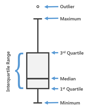
Box plots allow you to visualize and compare the distribution and central tendency of numeric values through their quartiles. Quartiles are a method of splitting numeric values into four equal groups based on five key values: minimum, first quartile, median, third quartile, and maximum. Box plots use the percentile calculation to determine quartile values. For example, the first quartile is equal to the 25th percentile.
The box portion of the diagram below illustrates the middle 50 percent of the data values, also known as the interquartile range (IQR). The median of the values is depicted as a line splitting the box in half. The IQR illustrates the variability in a set of values. A large IQR indicates a large spread in values, while a smaller IQR indicates most values fall near the center. Box plots also illustrate the minimum and maximum data values through whiskers, or lines, extending from the box, and optionally, outliers as points extending beyond the whiskers.

Variables
Box plots are composed of an x-axis and a y-axis. The x-axis assigns one box for each Category or Numeric field variable. The y-axis is used to measure the minimum, first quartile, median, third quartile, and maximum value in a set of numbers.
You can use box plots to visualize one or many distributions. To visualize a single distribution, add one Numeric field variable. This results in a chart with one box plot visualizing the distribution of the chosen numeric attribute.
You can add additional Numeric field variables to compare multiple distributions from different attribute fields in a table. For example, in a county dataset, Population2010 and Population2015 are added as Numeric field variables. The resulting chart displays two box plots, one visualizing the distribution of Population2010, and the other visualizing the distribution of Population2015, for all counties in the dataset.
When only a single Numeric field variable is added, you have the option of adding a Category variable as a method of comparing distributions across categories. For example, Population2010 is set as the Numeric field variable and StateName as the Category variable for a county dataset. The resulting chart displays a box plot for each state, visualizing the distribution of Population2010 for all counties belonging to each state.
Multiple series
You can use multiple series box plots to compare distributions of different types, or by different categories.
Multiple series box plots can be created by specifying a Category field and multiple Numeric fields, or by specifying a Split by category field.
When using a Category variable with multiple Numeric fields, each Numeric field added to the series table creates a series. For example, in a county dataset, StateName is set as the Category variable and Population2010, Population2015, and Population2020 are set as the Numeric field variables. The resulting chart will have states as categories along the x-axis, with three series each (Population2010, Population2015, and Population2020).
Alternatively, a Split by variable can be added as a way to further divide the data and create multiple series. For example, Population2010 is set as the Numeric field variable, StateName as the Category variable, and ElectionWinner as a Split by field for a county dataset. The Series table will populate with each unique ElectionWinner value (Democrat or Republican). The resulting chart will display two side-by-side box plots for each state (100 box plots total), one visualizing the distribution of Population2010 of all counties in each state with the ElectionWinner value of Democrat, and one for all counties in each state with the ElectionWinner value of Republican.
You can also use Split by fields when multiple Numeric field variables are used instead of a Category variable. For example, Population2010, Population2015, and Population2020 are set as the Numeric field variables and ElectionWinner is set as the Split by field for a county dataset. The resulting chart will display the three Numeric field variables along the x-axis (Population2010, Population2015, and Population2020), each with two side-by-side box plots: one displaying the distribution for all counties with the ElectionWinner value of Democrat, and the other for all counties with the ElectionWinner value of Republican.
Display multiple series
When you use a Split by field to create multiple series, you have two options for visualizing the results:
- Side-by-side
 —Create side-by-side box plots, one for
each series.
 - As mean lines
 —Create one box
plot for each Category value or Numeric field variable and use lines to show
the mean for each unique value in the Split by field.
For example, Population2010 is set as the Numeric field variable, StateName is set as the Category variable, and ElectionWinner is set as a Split by field for a county dataset. The Series table populates each unique ElectionWinner value (Democrat and Republican), but instead of splitting each state into a box plot for each ElectionWinner value, the resulting chart displays one box plot for each state visualizing the distribution of Population2010 for counties within that state, and the mean value of each Split by series (Democrat and Republican) is overlaid on the box plots showing where the mean value of each series falls in relation to the total distribution.
Standardization
When you create a box plot from multiple Numeric fields, a z-score standardization is applied by default. Standardization allows numeric variables of different units to be comparable.
For example, a box plot comparing the distributions of income (with values in the tens of thousands) and unemployment rate (values ranging between 0 and 1.0) would be difficult to read without standardization because the unemployment rate values are so much smaller than the income values.
Standardization of the attribute values involves a z-transform, where the mean for all values is subtracted from each value and divided by the standard deviation for all values. The z-score standardization puts all the attributes on the same scale, allowing multiple distributions to be visualized in the same chart. To visualize the raw values instead, uncheck the Standardize values (z-score) check box in the Chart Properties pane.
Axes
Several options control the axes and related settings.
X-axis label character limit
Category labels are truncated at 11 characters by default. When labels are truncated, you can hover over the label to view the full text. To display the entire label text in the chart, increase the label character limit.
Y-axis bounds
Default y-axis bounds are set based on the range of data values represented on the y-axis. Customize these values by typing a new axis bound value. You can set axis bounds to keep the scale of your chart consistent for comparison. Click the Reset button  to revert the axis bound to the default value.
Grid intervals
Configure grid intervals for the y-axis using the Interval control. The default grid interval will be calculated automatically.
Number format
You can format the way an axis displays numeric values by specifying a number format category or by defining a custom format string. For example, use $#,### as a custom format string to display currency values.
Appearance
Several options control the chart appearance and related settings.
Titles and description
Charts and axes are given default titles based on the variable names and chart type. These can be edited on the General tab in the Chart Properties pane. You can also provide a chart Description, which is a block of text that appears at the bottom of the chart window.
Visual formatting
You can configure the look of your chart by formatting text and symbol elements, or by applying a chart theme. Format properties can be configured on the Format tab in the Chart Properties pane. A chart theme can be selected on the Chart tab. Chart formatting options include the following:
- Size, color, and style of the font used for axis titles, axis labels, description text, legend title, legend text, and guide labels
- Color, width, and line type for grid and axis lines
- Background color of the chart
Color
Box plots match the outline and fill colors defined in the layer symbology whenever possible. When series are split in a way that does not correspond with the layer symbology, a standard color palette is applied. You can change series colors on the Series tab in the Chart Properties pane by clicking the Symbol color patch in the Series table and choosing a new color.
Sort
Box plots are automatically sorted alphabetically by their categories (x-axis ascending). You can change this using the Sort options in the Chart Properties pane. The following sort options are available for box plots:
- X-axis Ascending—Categories are arranged alphabetically from left to right.
- X-axis Descending—Categories are arranged in reverse alphabetical order.
- Mean Ascending—Boxes are arranged by the mean statistic in ascending order.
- Mean Descending—Boxes are arranged by the mean statistic in descending order.
- Median Ascending—Boxes are arranged by the median statistic in ascending order.
- Median Descending—Boxes are arranged by the median statistic in descending order.
- Custom sort—Categories can be arranged manually in the Custom sort table.
Orientation
Draw boxes horizontally by clicking the Rotate chart button  in the chart window.
Guides
Guide lines or ranges can be added to charts as a reference or way to highlight significant values. To add a new guide, on the Guides tab in the Chart Properties pane, click Add guide. To draw a line, enter a Value where you want the line to draw. To create a range, enter a to value. You can optionally add text to your guide by specifying a Label.
Example
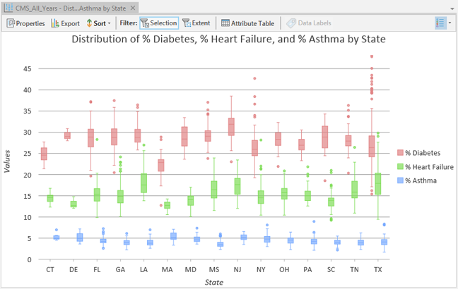
Create a box plot to compare the distributions and variability of chronic health conditions by state.
- Numeric fields—% Diabetes, % Asthma, % Heart Failure
- Category—State
