Text symbols draw labels, annotation, titles, dynamic text, descriptions, callouts, legends, scale bars, graticule labels, tables, and other textual information on maps and layouts. A key difference between text symbols and other common symbol types—point, line, and polygon symbols—is that text symbols can have only one symbol layer.
Text symbols control how text looks and can be used as a way to categorize named features. For example, text symbol size can indicate relative population for city name labels. To set a text symbol, you can choose a font, size, and color, but you can also work with more advanced text symbol properties to get effects such as balloon callouts, line callouts (with or without leader lines), text inside highway shields or other markers, filled text, halos, and drop shadows.
Tip:
Text properties include options for changing the font, style, formatting, and effects. A label is drawn with text symbols but is derived from feature attributes and has additional properties for placement and conflict detection.
- Learn more about changing the text symbol for dynamic labels
- Learn more about editing the appearance of annotation features
- Learn more about saving a text symbol to a style
Fonts
Fonts are graphical representations of text composed of different sizes, weights, colors, and styles. Each font family contains one or more font styles. Depending on the font, the styles may include regular, bold, italic, any combination of these, or an extended list. The styles are found in the Font name drop-down list and the Font style drop-down list. Variable fonts contain named instances of font styles and also allow customization.
Supported fonts include the following:
- Type 1 font

- TrueType font

- PostScript OpenType font

- TrueType OpenType font

- Variable PostScript OpenType font

- Variable TrueType OpenType font

ArcGIS Pro loads fonts from the following:
- Windows available fonts
- Includes temporarily registered fonts, for example, Adobe Fonts
- ArcGIS Pro Resources (C:\<your install path to ArcGIS Pro>\Resources\Fonts)
Variable fonts
Variable fonts are modern open type fonts that enable customization of their font variations, such as weight, width, and slant. The available preset styles, variation axes, and their value ranges depend on the font.
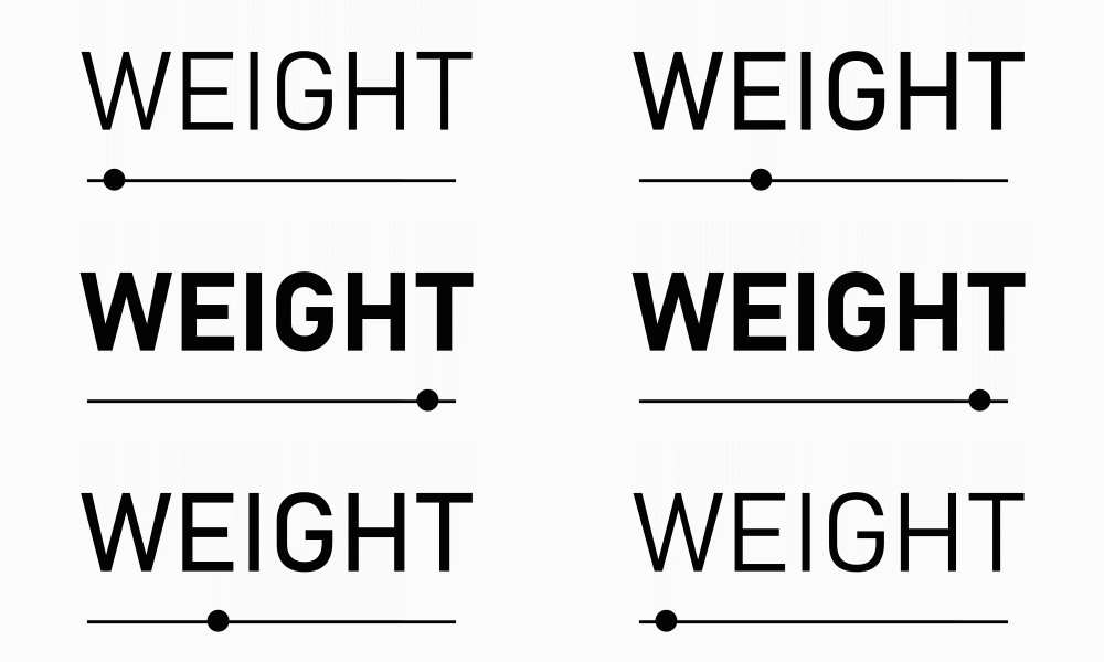
An example of a variable font is Bahnschrift. The animation below shows how the weight variation changes as the slider is dragged. 
Text font size
ArcGIS Pro uses software-scalable fonts to display text. This allows the labels and annotation to draw at different map scales while maintaining their display properties. An example of a software-scalable font is Arial (Open Type).
When displaying text, the actual height of a text character varies from font to font. A type character is measured from the top of its ascender line to the bottom of its descender line, as shown in the following diagram:

The character cell is a box that surrounds the individual character. If the text character does not occupy the entire height of the character cell, the character appears smaller than the specified point size.
Text font size measurement using points
A point is the standard unit of measure for character height and width. You can provide points in whole and half sizes. Use the following conversions as a reference guide for point sizes:
Point to Inch Conversion Table
| Points | Inches |
|---|---|
1 | 0.014 |
12 (1 pica) | 0.166 |
18 | 0.250 |
24 | 0.332 |
36 | 0.500 |
72 (6 picas) | 1.000 |
Horizontal and vertical alignment
You can set horizontal and vertical alignment on the text symbol for single and multiline blocks of text.
Note:
When labeling, you cannot set the vertical alignment; it is set by the label engine. Horizontal alignment can be set when using the Standard Label Engine; it cannot be set when using the Maplex Label Engine. When using the Maplex Label Engine, it is configured using the Stack properties.
Horizontal alignment controls how multiline text is aligned and also how single and multiline text expands or contracts when edited. For example, if a left-aligned line of text expands in length, the left side of the text stays in place and it expands to the right. In the same scenario, a center-aligned line of text expands around the center point.
Horizontal alignments include the following:
- Left alignment

- Center alignment

- Right alignment

- Justified alignment

Vertical alignment controls where the text is placed around its baseline geometry.
The table below shows the vertical alignment options and an example for each. In the example, the line denotes the baseline of the text.
| Vertical alignment | Example |
|---|---|
Top alignment |  |
Center alignment |  |
Bottom alignment |  |
Baseline alignment |  |
Text callouts with or without leader lines
The most useful types of callouts are balloon callouts and background callouts. Both types have two parts: the border drawn around the text and a leader line that extends from the text to a point on your map. A border serves to separate text visually from other information on your map, while leaders are useful because they allow text to be placed farther away from the feature or area on the map that it references. Balloon callouts always have both a border and leader line, while with background callouts, you can turn the border, leader line, and accent bar on or off.
Leader tolerance
If you're using leader lines, the leader tolerance is the minimum distance between the leader anchor point and text at which the leader line appears. If the distance between the leader anchor point and text is less than the leader tolerance, no leader shows. To change this distance, edit the label offset.
- Learn more about offsetting labels from points
- Learn more about offsetting labels from lines
- Learn more about offsetting labels from polygon boundaries
If you're using dynamic labels, the leader anchor point is on the feature being labeled. Decrease the leader tolerance if you want leaders to appear for labels that are relatively close to the features they are labeling. Conversely, increase the leader tolerance if you only want leaders to appear for labels relatively far from the labeled features.
If you have annotation, you can move the text toward or away from the anchor point. If you move the text closer to the anchor point, the leader disappears once the distance is less than the leader tolerance. If you move the text farther from the anchor point, the leader reappears once the distance is greater than the leader tolerance.
Composite callout
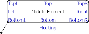
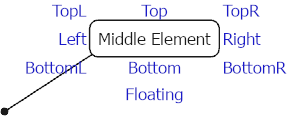
A composite callout is an advanced callout that has additional parts that hang from it relative to the edge of the callout symbol. The parts are placed in nine locations surrounding the middle element using the <PART> formatting tag and are individually controlled for alignment and offsets. The composite callout also supports the use of vertical Morse code. Aeronautical charts are a common place composite callouts are used.
The images below show composite callouts with their parts contained within the callout and on the exterior of the callout. 

Text inside highway shields or other point symbols
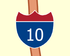
Drawing a point symbol as a background to a text symbol gives a different effect from a balloon or background callout. Point symbol backgrounds are commonly used to label numbered highways; the symbol can classify the highway type. You can optionally scale the symbol to match the text string size. This is useful if highways of a similar class have different numbers of digits.


