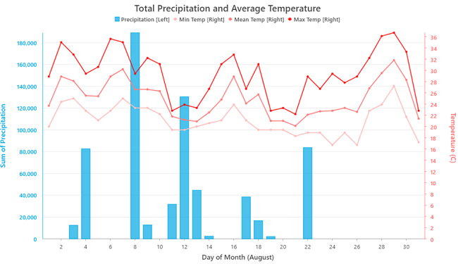
Combo charts provide the flexibility to combine bar and line series in a single chart. This allows you to use the appropriate series type for your data, while also facilitating comparisons between series of different types. Combo charts support an optional secondary y-axis, which supports comparing series with different y-axis scales. Use a secondary y-axis when the magnitude of the values is less important than how trends are related between series.
Variables
Combo charts are made up of one x-axis and one or two y-axes.
The x-axis can represent discrete categories or continuous values depending on the X-axis field type. String fields will create a categorical x-axis while numeric or date fields will create a continuous x-axis.
The y-axis or y-axes represent the associated numeric value that corresponds to each category or continuous interval on the x-axis. The height of the bars or position of the lines against their respective y-axis corresponds to aggregated numeric values or row counts associated with each position on the x-axis.
One or multiple bar or line series can be added to each y-axis. Use the Left y-axis and Right y-axis controls to add series to the desired y-axis. The scale of each y-axis will correspond to the range of values in its associated series.
Note:
When a y-axis contains a bar series, it must have a zero origin.
By default, when an X-axis field is configured, a combo chart will display the row count for each unique category or continuous range as a bar series on the left y-axis. Numeric fields can also be summarized to represent aggregated values on either y-axis. Each row count or aggregated numeric field can be configured to display as a bar or line series.
Numeric fields must be aggregated using one of the following methods:
- Count
- Sum
- Mean
- Median
- Minimum
- Maximum
Time binning options
When a date field is used for the X-axis field, time binning options can be configured by turning on the Enable temporal binning toggle button. When temporal binning is enabled, several options control the interval size and related settings applied to the binning.
Interval size
Temporal data is binned into time intervals along the x-axis. The default interval size is based on the temporal extent of the dataset and can be changed using the Interval size option.
Empty bins
Depending on the sparsity of the dataset and the time interval size specified for binning, there may be bins that contain no data. Empty bins may be treated as zero when a lack of data truly represents a value of zero. For example, no illnesses were reported in May or no rain was collected during a week span. It is not appropriate to assign a zero value to a bin when no data exists because none was collected. For example, no reading from a temperature gauge does not mean there was a temperature of zero.
The following are the options for handling empty bins:
- Treat as zero—Empty bins are displayed with a zero value.
- Treat as null—Empty bins are not displayed.
Interval alignment
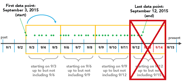
Time intervals may align to the first data point, the last data point, or a specific reference time.
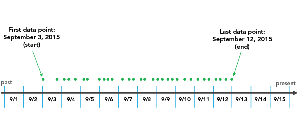
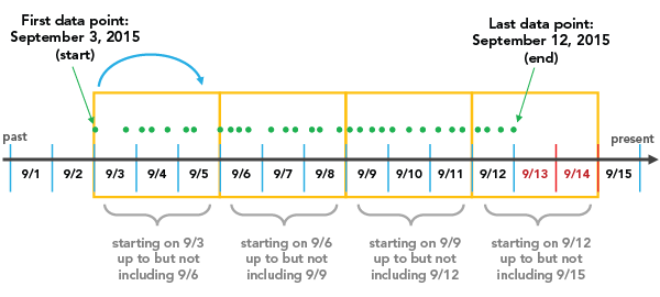
The Snap to first data point option initiates binning with the earliest date and works forward in time.
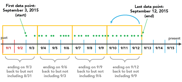
The Snap to last data point option initiates binning with the most recent date and works backward in time.
The Reference time option initiates binning on a specified date.
Interval alignment is important to consider because, depending on the configuration, partially empty bins may be created. Partially empty bins can give the misleading impression that there is a dip in the value or count during that time, when really the data collection began or ended during the span of that bin. To avoid bin bias, check the Trim incomplete interval option. This removes the partially filled bin from the visualization.
Axes
Several options control the axes and related settings.
X-axis label character limit
Category labels are truncated at 11 characters by default. When a label is truncated, hover over the label to view the full text. To display the entire label text in the chart, increase the label character limit.
Axis bounds
Default bounds for numeric axes are based on the range of data values represented on the axis. You can customize these values by providing a new axis bound value. You can set axis bounds to keep the scale of the chart consistent for comparison. Click the Reset button  to revert the axis bound to the default value.
Note:
Since bar series use length to represent relative value, it is important that all combo charts with a bar series include an origin of zero on the y-axis.
Grid intervals
Configure grid intervals for either y-axis using the Interval control. The default grid interval will be calculated automatically.
Number format
You can format the way an axis displays numeric values by specifying a number format category or defining a custom format string. For example, you can use $#,### as a custom format string to display currency values.
Appearance
Several options control the chart appearance and related settings.
Titles and description
The charts and axes default titles are based on the variable names and chart type. These can be edited on the General tab in the Chart Properties pane. You can also provide a value for the Description option, which is a block of text that appears at the bottom of the chart window.
Visual formatting
You can configure the look of a chart by formatting text and symbol elements, or by applying a chart theme. Format properties can be configured on the Format tab in the Chart Properties pane. A chart theme can be selected on the Chart tab. Chart formatting options include the following:
- Size, color, and style of the font used for axis titles, axis labels, description text, legend title, legend text, and guide labels
- Color, width, and line type for grid and axis lines
- Background color of the chart
Color
Combo charts match the outline and fill colors defined in the layer symbology whenever possible. You can change series colors on the Series tab in the Chart Properties pane by clicking the Symbol color patch in the Series table and choosing a new color.
Sort
Combo charts support sorting only when the X-axis field is categorical. In this case, the series will automatically be sorted alphabetically by their categories (x-axis ascending). You can change this using the Sort options in the Chart Properties pane. The following sort options are available for combo charts:
- X-axis Ascending—Categories are arranged alphabetically from left to right.
- X-axis Descending—Categories are arranged in reverse alphabetical order.
- Y-axis Ascending—Categories are arranged by their value, from smallest to largest.
- Y-axis Descending—Categories are arranged by their value, from largest to smallest.
- Custom—Categories can be arranged manually in the Custom sort table.
Data labels
Labels displaying the value of each series can be turned on by checking Label series on the Data tab in the Chart Properties pane.
Guides
Guide lines or ranges can be added to charts as a reference or to highlight significant values. To add a new guide, on the Guides tab in the Chart Properties pane, click Add guide. To draw a line, provide a value for Value where you want the line to draw. To create a range, provide a to value. You can also add text to a guide by specifying a Label value.
Example
Create a combo chart to compare total daily precipitation with average, minimum, and maximum daily temperature during the month of August using the following settings:
- X-axis—Date
- Left y-axis:
- Field name—Precipitation, Aggregation—Sum, Series type—Bar
- Right y-axis:
- Field name—Temperature, Aggregation—Mean, Series type—Line
- Field name—Temperature, Aggregation—Minimum, Series type—Line
- Field name—Temperature, Aggregation—Maximum, Series type—Line
