You can learn a lot about a knowledge graph with histograms that visually represent its content. The histograms in the Search And Filter pane can be used with an investigation view to explore its contents, with a map to explore the contents of a knowledge graph layer, or with a link chart to explore the entities and relationships it describes.
You can open the Search And Filter pane from an investigation, a map, or a link chart. Once the pane is open, it can be paired with any view that provides access to a knowledge graph's content. For example, if you first open the pane from an investigation, histograms will be generated to represent the contents of the investigation. After adding an entity type to a map, the pane can instead be paired to the knowledge graph layer on the map. The histograms displayed in the pane will update to represent the knowledge graph layer's content.
You can adjust how the histogram bars are labeled, ordered, and positioned to suit your data and your preferences.
- Open the Search And Filter pane using one of the following methods:
- On the Investigation tab on the ribbon, in the Search group, click Search And Filter
 .
. - Click a knowledge graph layer in the map's Contents pane. Access the Data tab from the Knowledge Graph Layer tab on the ribbon. In the Search group, click the Search And Filter button
 .
. - On the Link Chart tab on the ribbon, in the Search group, click Search And Filter
 .
.
The Search And Filter pane appears.
- On the Investigation tab on the ribbon, in the Search group, click Search And Filter
- Click the Dataset drop-down list and click the name of the investigation, map, or link chart you want to explore.
- Click the name of the investigation in your project to explore the portion of the knowledge graph that currently appears in the investigation's contents list. For example, if the Person entity is currently selected in the investigation's Contents pane and the first 1,000 entities are listed, the histogram will represent content associated with the 1,000 Person entities only. If the investigation is named Investigation, the entry in the Dataset drop-down list will be Investigation.
- Click the name of the knowledge graph layer on the map to explore the portion of the knowledge graph that currently appears on the map. For example, if the map only includes Person, Pet, and Veterinarian entities and the HasPet and HasPatient relationships, only these entity types and relationship types on the map are represented by the histograms. If the map is named Map and the knowledge graph layer on the map is named MyKnowledgeGraph, the entry in the Dataset drop-down list will be Map - MyKnowledgeGraph.
- Click the name of the link chart to explore the portion of the knowledge graph that currently appears on the link chart. For example, if the link chart only includes a queried set of Person and Vehicle entities and the HasVehicle relationship, only the specific entities and relationships on the link chart are represented by the histograms. If the link chart is named Link Chart, the entry in the Dataset drop-down list will be Link Chart.
- If you want to explore the entire knowledge graph that is referenced by the investigation, the knowledge graph layer on a map, or the link chart, click the entry corresponding to the view or map layer followed by Knowledge Graph. For example, if the map is named Map and the knowledge graph layer on the map is named MyKnowledgeGraph, the entry in the Dataset drop-down list corresponding to the entire knowledge graph will be Map - MyKnowledgeGraph.- Knowledge Graph.
- Click the Histogram tab
 .
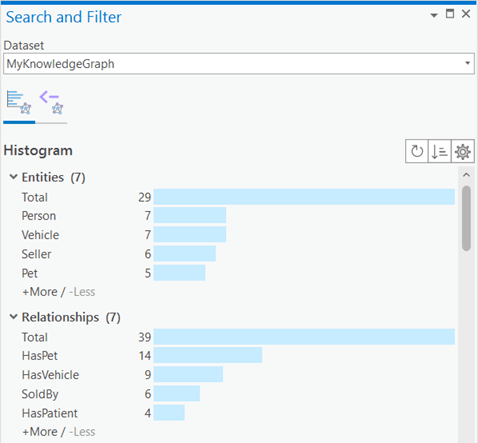
.Histograms are generated that summarize the content in the paired view or knowledge graph.
- If you query the paired view or knowledge graph on the Query tab
 , the histograms are updated to reflect the content returned by the query.
 - When you have finished querying the paired view or knowledge graph, click Clear on the Query tab
 , and click the Refresh button
  on the Histogram tab
  .
.The histograms are updated to reflect the contents of the paired view or knowledge graph.
Information displayed in the histograms
You can use histograms to describe the following general categories of information:
- Entities—Summarizes the entity types in the knowledge graph and how many instances of each entity type have been created. This is a graphical representation of the entity type information that is also provided in the investigation's Contents pane on the By Type tab
 . In the example below, the paired view includes 29 entities representing seven entity types.
 - Relationships—Summarizes the relationship types in the knowledge graph and how many instances of each relationship type have been created. This is a graphical representation of the relationship type information that is also provided in the investigation's Contents pane on the By Type tab
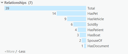
 . In the example below, the paired view includes 39 relationships representing seven relationship types.
 - Connected information—Summarizes the number of relationships created to connect entities of different types. Histograms describing the relationships created for each type of entity are listed under the Entities subheading. Histograms describing the entities connected by each relationship are listed under the Relationships subheading. In the example below, there are five Person entities, which have a total of 30 relationships to other entities in the knowledge graph.
- Properties—Summarizes the values provided in each property for all entities and relationships in the graph that have a property of the same name. For example, if two different entity types have a date property, the histogram will show dates provided for all entities of both entity types. If some entities or relationships do not have a value set for a given property, there is a bar in the histogram representing the number of null values that exist; null is a representation of the fact that there is no value. In the example below, there are eight graph items that have a value for the make property; in one case, the graph item has a null value.
As you interact with the paired view, the content represented by the histograms will change accordingly to show more or less content.
Select different content in the paired view
The Search And Filter pane is paired with the view identified in the Dataset drop-down list. As you select different content in the paired view, the histograms update automatically to reflect the selected content. For example, if the Search And Filter pane is paired with a link chart and you add content to the link chart, the histograms will be updated to reflect the added entities and relationships.
Similarly, when the Search And Filter pane is paired with an investigation and you select Entity Types  in the Contents pane, the histogram updates to characterize only the entity types in the investigation. When you select a specific entity type in the Contents pane, the histogram updates to display information specific to the entities in the graph of the selected entity type.
- In the Search And Filter pane, click the Dataset drop-down list and click the current investigation's name.
- Click the Histogram tab
 .
.Histograms are generated that summarize all content in the current investigation. Under the Entities and Relationships headings, there are bars in the histograms for all entity types and relationship types in the knowledge graph. Under the Connected Information heading, relationships are characterized for all entities and relationships in the knowledge graph. Under the Properties heading, properties are summarized for all entities and relationships in the investigation.
- In the investigation's Contents pane, click Entity Types
 .
.The histogram under Entities is the same, but no histogram is displayed under Relationships because no relationships are selected. Under Connected Information, the number of relationships defined for each entity type are summarized, but details for the relationships in the knowledge graph are not. Under Properties, properties and their values are summarized only for entities in the knowledge graph.
- In the investigation's Contents pane, click a specific entity type.
The histogram under Entities only has one bar to represent the selected entity type. Under Connected Information, only relationships for the selected entity type are summarized. Under Properties, property values are summarized only for the selected entity type.
Recalculate the histograms
The histograms update dynamically to represent the content selected in the view associated with the Search And Filter pane. However, if someone else adds new content to the knowledge graph, it won't appear in the histograms automatically. You can refresh the histograms at any time to ensure you are seeing a summary of the graph's current data.
- Click the Histogram tab
 in the Search And Filter pane.
 - Click the Refresh button
 at the top of the tab.
The histograms are recalculated based on the current data in the knowledge graph that participates in the paired view.
Hide and show information
If the paired view or knowledge graph has a large amount of content, there will be many histograms conveying a large amount of information. Some options are available in the Search And Filter pane that can help you evaluate and assess the histograms in which you are interested. You can collapse all headings at once if you don't want to scroll through all the histograms that have been calculated. You can expand all headings at once after applying a query so there is less content to navigate, for example.
Each histogram is initially presented by showing up to five values. If a histogram has more than five values, a toggle button at the bottom allows you to add more values to the histogram. You can remove the added values from the histogram again when you are ready to explore other information. Values are added to or removed from the histogram five at a time.
Similarly, under Connected Information, histograms are only shown by default for the first five entity types or relationship types in the knowledge graph. Similarly, under Properties, histograms are only shown for the first five properties in the knowledge graph. If the graph contains more than five entity types, relationship types, or properties, a toggle button at the bottom of those sections allows you to add histograms for five more items at a time. You can also remove items from these sections later, five at a time.
- Click the Histogram tab
 in the Search And Filter pane.
 - Click the Settings button
 at the top of the tab.
 - Click an option to change how the histograms are presented in the pane.
- Click Collapse all to collapse all headings at once in the pane, and click a heading to show the histograms under that heading.
- Click Expand all to expand all headings at once.
- If there are more than five values in a histogram, options that allow you to show more or less information are present at the bottom of the graph.
- Click + More to add five more bars to the histogram.
- Click - Less to remove five bars from the histogram.
- In the Connected Information section, under the Entities and Relationships headings, and under Properties, there are options to show histograms for more items, or to hide histograms in the list.
- Click + More Entities, + More Relationships, or + More Properties to add histograms for five more entities, relationships, or properties to the list.
- Click - Less Entities, - Less Relationships, or - Less Proeprties to remove histograms for the last five entities, relationships, or properties from the list.
Sort bars in the histogram and remove the total
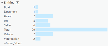
Bars in a histogram are sorted numerically, by default, based on the number of instances of a specific value. However, you can sort the bars alphabetically based on their labels instead. You can change the sort order to show values as they increase in value or decrease in value, as needed. If the number of instances of each entity is small, but the total number of entities is large, it can be helpful to remove the bar representing the total count from the histogram. These changes apply to all histograms in the pane.
- Click the Sort button
 at the top of the Histogram tab
  .
. - Check a different sort option to change how the bars of the histograms are arranged.
- Alphabetically (ascending)—Bars in the histogram are sorted alphabetically from A to Z, by the name of the item represented by the bar.
- Alphabetically (descending)—Bars in the histogram are sorted alphabetically from Z to A, by the name of the item represented by the bar.
- Count (ascending)—Bars in the histogram are sorted numerically from 1 to 10, by the number of items represented by each bar.
- Count (descending)—The default option. Bars in the histogram are sorted numerically from 10 to 1, by the number of items represented by each bar.
- Click the Settings button
 at the top of the tab.
 - Uncheck the Show total bars option.
Without the Total bar, a total count of the number of values portrayed in the graph is not available. However, you may be able to visualize the information presented by other bars in the histogram more clearly.
Reposition the histogram baseline
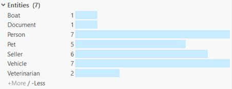
A histogram is essentially a bar graph on its side. All histograms in the Search And Filter pane are positioned so the bottoms of the graphs, which represent a zero or null value, are in line. You can reposition this baseline to specify where the graphs will start in the pane. This allows you to accommodate wider labels or highly variable values in the graphs as needed. In the example below, the labels are truncated because they are too long for the available space.
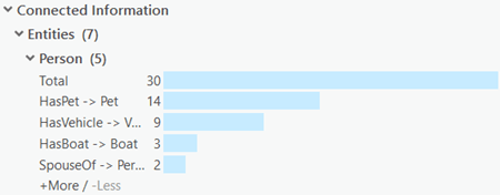
These changes apply to all histograms in the pane. When the baseline is moved to make long labels completely visible, in other histograms the bars may be so far from their short labels that it can be difficult to tell which label is associated with which bar. In this case, consider changing how the labels are placed to put the labels near the bars.
- Click the Settings button
 at the top of the Histogram tab
  .
. - Check Adjust bar baseline.
A movable vertical bar appears in the Search And Filter pane.
- Drag the bar left or right to adjust where in the pane the histogram baseline is positioned.
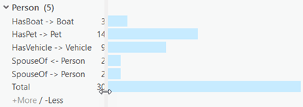
- When you are satisfied with the baseline's position, click the Settings button
 again, and uncheck Adjust bar baseline.
Change how bars are labeled
You can adjust how the bars in your histograms are labeled to optimize your space in the Search And Filter pane. Labels for the bars can be aligned with the headings in the pane, or aligned with the baseline of the histogram to suit your preference. Also, the value indicating what each bar represents can be positioned at different places on or around the bars of the graph.
By default, the label for each bar in the histogram is aligned with the headings in the pane, and a histogram bar follows the label on any given line. The value represented by each bar is placed outside the bar at the bottom of the graph.
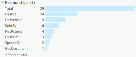
- Click the Settings button
 and check Labels near bars.
The labels for each bar are rearranged so they are aligned with the histogram's baseline.
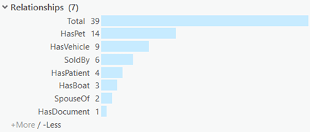
- Click the Settings button
 and uncheck Bars follow labels.
Each line in the histogram is rearranged so the bar appears first, followed by its label.
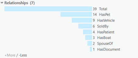
- Click the Settings button
 and check Histogram values inside bottom.
The value represented by each bar is placed inside the bar at the bottom of the graph.
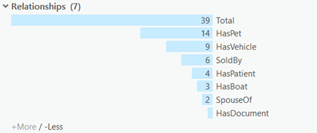
- Click the Settings button
 and check Histogram values inside top.
The value represented by each bar is placed inside the bar at the top of the graph.
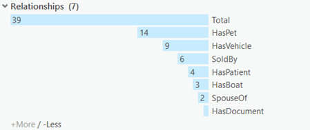
- Click the Settings button
 and check Histogram values outside top.
The value represented by each bar is placed outside the bar at the top of the graph, except in the case where the bar for the graph extends all the way to the edge of the Search And Filter pane. For bars that extend to the edge of the pane, the value remains inside of the bar at the top of the graph.
