Text symbols draw labels, annotation, titles, dynamic text, descriptions, callouts, legends, scale bars, graticule labels, tables, and other textual information on maps and layouts. A key difference between text symbols and other common symbol types—point, line, and polygon symbols—is that text symbols can have only one symbol layer.
Text symbols control how text looks and can be used as a way to categorize named features. For example, text symbol size can indicate relative population for city name labels. Setting a text symbol can be as easy as choosing a font, size, and color, but you can also work with more advanced text symbol properties to get effects such as balloon callouts, line callouts (with or without leader lines), text inside highway shields or other markers, filled text, halos, and drop shadows.
Tip:
Text properties include options for changing the font, style, formatting, and effects. A label is drawn with text symbols but is derived from feature attributes and has additional properties for placement and conflict detection.- Learn more about changing the text symbol for dynamic labels
- Learn more about editing the appearance of annotation features
- Learn more about saving a text symbol to a style
Text callouts, with or without leader lines
The most useful types of callouts are balloon callouts and background callouts. Both types have two parts: the border drawn around the text and a leader line that extends from the text to a point on your map. A border serves to separate text visually from other information on your map, while leaders are useful because they allow text to be placed farther away from the feature or area on the map that it references. Balloon callouts always have both a border and leader line, while with background callouts, you have the option to turn the border, leader line, and accent bar on or off.
Leader tolerance
If you're using leader lines, the leader tolerance is the minimum distance between the leader anchor point and text at which the leader line appears. If the distance between the leader anchor point and text is less than the leader tolerance, no leader shows. To change this distance, edit the label offset.
- Learn more about offsetting labels from points
- Learn more about offsetting labels from lines
- Learn more about offsetting labels from polygon boundaries
If you're using dynamic labels, the leader anchor point is on the feature being labeled. Decrease the leader tolerance if you want leaders to appear for labels that are relatively close to the features they are labeling. Conversely, increase the leader tolerance if you only want leaders to appear for labels relatively far from the labeled features.
If you have annotation, you can move the text toward or away from the anchor point. If you move the text closer to the anchor point, the leader disappears once the distance is less than the leader tolerance. If you move the text farther from the anchor point, the leader reappears once the distance is greater than the leader tolerance.
Composite callout
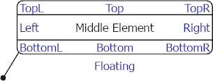
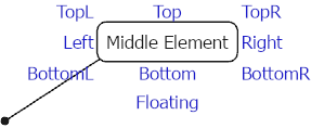
A composite callout is an advanced callout that has additional parts that hang from it relative to the edge of the callout symbol. The parts are placed in nine locations surrounding the middle element using the <PART> formatting tag and are individually controlled for alignment and offsets. The composite callout also supports the use of vertical Morse code. Aeronautical charts are a common place composite callouts are used.
The images below show composite callouts with their parts contained within the callout and on the exterior of the callout.


Text inside highway shields or other point symbols
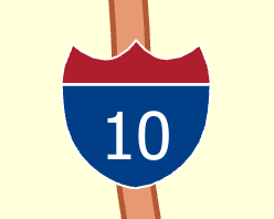
Drawing a point symbol as a background to a text symbol gives a very different effect than drawing a balloon or background callout. Point symbol backgrounds are commonly used to label numbered highways; the symbol can classify the highway type. The symbol can be optionally scaled to match the text string size. This is useful if highways of a similar class have different numbers of digits.
Text bold and italic styles
The availability of bold and italic font styles is shown in both the Font name drop-down list and the Font style drop-down list. Note that some fonts may not have both bold and italic styles, and some fonts may have extended styles.
Text font size
ArcGIS Pro uses software scalable fonts to display text. This allows the labels and annotation to draw at different map scales while maintaining their display properties. An example of a software scalable font is Arial (Open Type).
When displaying text, the actual height of a text character varies from font to font. A type character is measured from the top of its ascender line to the bottom of its descender line, as shown in the following diagram:

The character cell is a box that surrounds the individual character. If the text character does not occupy the entire height of the character cell, the character appears smaller than the specified point size.
Measure text font size using points
A point is the standard unit of measure for character height and width. Points can be entered in whole and half sizes. The following conversions can be used as a reference guide for point sizes:
Point to Inch Conversion Table
| Points | Inches |
|---|---|
1 | 0.014 |
12 (1 pica) | 0.166 |
18 | 0.250 |
24 | 0.332 |
36 | 0.500 |
72 (6 picas) | 1.000 |